Thursday, December 5, 2019
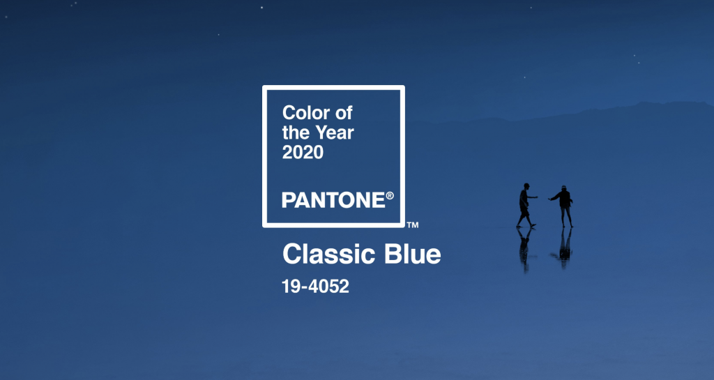
Pantone chooses the color of 2020. Do you like it?
2019Visual CommunicationDigital printing
A color that is pure inspiration and brings tranquility
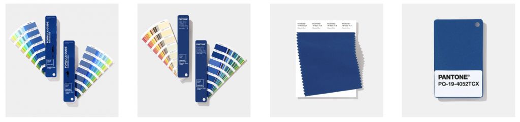
The color is defined as timeless and enduring. It's a shade of blue, PANTONE 19-4052 Classic Blue . An elegant color in its simplicity. Evoking an image of nature, such as the sky at sunset, it invites reflection and the opportunity to face new challenges with peace and serenity.
Imprinted on our psyches as a relaxing color, it brings a sense of peace and tranquility, aiding concentration and providing clarity in our thoughts.
For more than 20 years, Pantone's Color of the Year has influenced product development and purchasing decisions across multiple industries, including fashion, home furnishings, and industrial design, as well as product packaging and graphic design.
PANTONE Color of the Year
The Pantone Color of the Year selection process requires deep reflection and trend analysis. To arrive at the selection each year, the Pantone Color Institute's color experts search far and wide for new color influences. Everything is a source of inspiration. From the entertainment and film industry, past and contemporary art collections, fashion, design, tourism, and new lifestyles, among others. Influences can also come from new technologies, materials, textures and effects that impact color, social media platforms, and even upcoming sporting events that capture global attention.